
Why Expiry Trades Fail: The Invisible Wall Called Open Interest
SAHI
Do you ever feel like the market has a personal vendetta against your expiry trades?
You set it up right.
The chart lines up.
Price breaks out.
It runs… and then just stops. Reverses. Dies out in the middle of nowhere.
SL hits. You stare. And you think, what even was that?
That right there — that sudden wall, that invisible ceiling, that mysterious stall — is often open interest at work. It’s not price action failing. It’s you trading without seeing where the real positions are stacked.
And the market? It plays those levels to perfection.
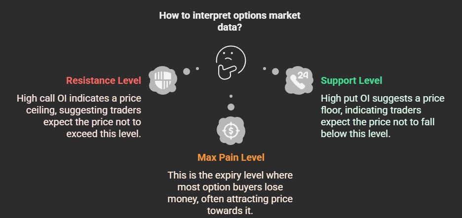
The options market leaves clues — and the biggest ones are sitting inside OI data.
When there’s a heavy buildup of calls at a strike, it’s not just coincidence. That level becomes resistance because traders — usually the smart money — are actively betting that price won't cross it.
Same with puts. High put OI? That’s a level they’re defending as support.
And then there’s Max Pain — the expiry level where the maximum number of option buyers lose money. It's not a meme. It’s not a myth. It’s real. And if you trade expiry long enough, you’ll see how often price drifts toward it — especially when there’s no strong directional bias.
These aren’t just numbers in the option chain.
They’re pressure zones.
And if you don’t see them, they’ll work against you.
Here’s the thing: you shouldn’t need to flip between the chart, the option chain, and some spreadsheet formula just to figure out where support is.
At Sahi, we built a chart overlay that puts Max Pain and OI levels right where you need them — on the actual chart.
Support and resistance zones update in real time based on live OI.
The Max Pain line floats along as it shifts through the session.
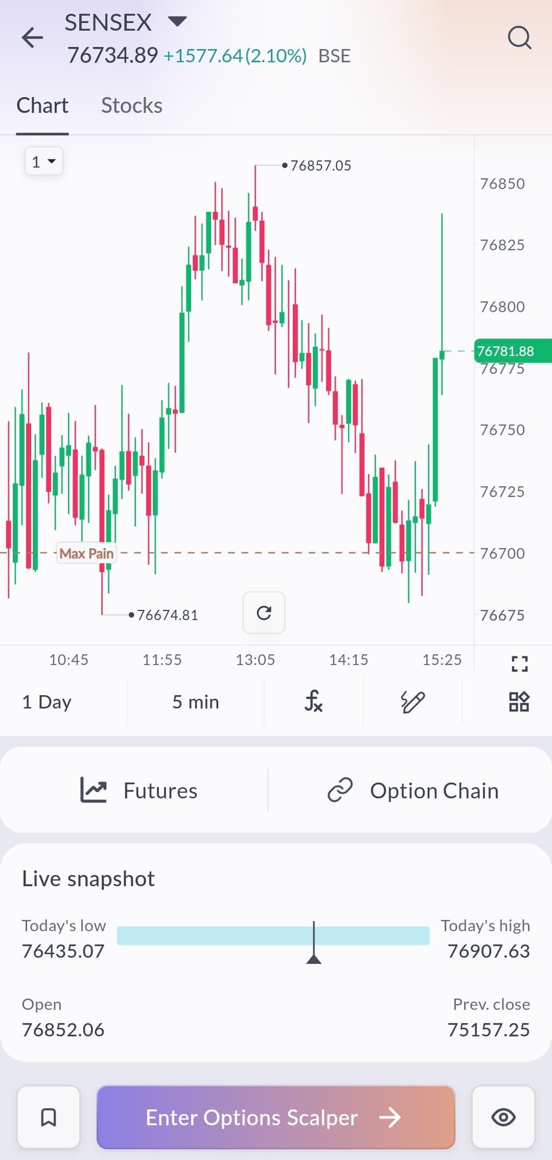
No mental math. No losing trades because you missed the invisible wall.
Just raw, visual clarity.
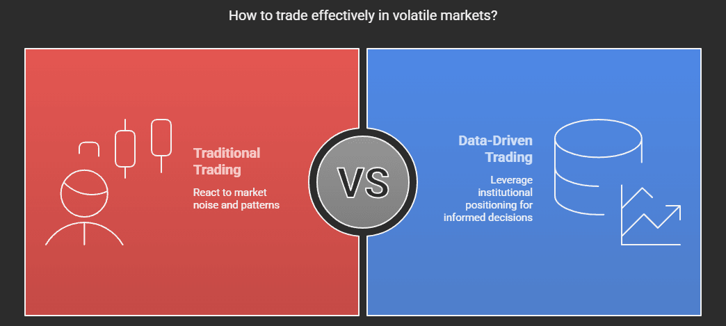
Markets aren’t trending cleanly right now. Volatility’s up. Expiry day is noisy.
If you’re trading without seeing where institutions are stacked, you’re reacting to half the story.
But when you have that data — and you can see it in real time — everything shifts.
You stop getting trapped in breakouts that run into resistance.
You catch reversals before they feel obvious.
And you build expiry trades around actual market positioning — not just candle patterns.
We built this because expiry is brutal when you're trading blind.
Now, you don’t have to.
The Max Pain + OI indicator is live in charts — ready for traders who are done guessing where the wall is.
It won’t make you a better trader.
But it’ll show you what the market is actually defending — and that changes everything.
Related
Market Minute | November 17, 2025
🚀 Nifty50 finds support at 25.7K, IT slips, PSU Banks gain: Top movers & key levels to watch!
Nifty Intraday Analysis Today (12 December 2025): Support, Resistance & Option Chain View
Market Minute | October 24, 2025
Recent
What is an IPO & How to Apply for an IPO on Sahi: Step-by-Step Guide
Indicator Templates: Build Once. Trade Faster Forever.
Pledging in Trading: How Traders Use Their Portfolio as Trading Capital
How to Read the Option Chain to Predict Market Moves in Weekly Expiries?
Bharat Coking Coal IPO Lists at 96% Premium: Market Verdict Defies GMP Cool-Off